Making a timing chart in Excel — Drawing with grid cells and borders, and where it falls apart
Last updated: 2026-09-23 / Category: Timing charts, comparing methods
An Excel timing chart built from a table of 1s and 0s holds up better than one drawn with borders. This guide is for anyone whose company specifications live in Excel and who wants the chart in the same workbook: the drawing steps, and where it falls apart.
1. If you draw with borders, make the columns a grid with one column per step
For one or two charts that will hardly change, borders are enough. Narrow the columns into a grid and draw the waveforms with borders; that is the usual way. The trouble starts when steps keep being added and signals keep being swapped (section 2).
- Make the columns a grid From column D onward, one column is one step. Columns A to C hold the signal name, direction and comment. Set the column width to 2 or 3 characters and number the steps in row 1.
- Draw BOOL signals with borders Use two rows per signal: ON is the bottom border of the upper row, OFF the bottom border of the lower row. A transition is a vertical border. Just filling the ON range is faster, but without values it is easy to miscount the step of a transition.
- Merge cells and write the value for numbers and states Merge the cells of a range with the same value and write "2" or "transferring". A vertical border marks the change.
- Draw causal relations with arrow shapes A relation such as "see the infeed request turn ON, then run the conveyor" becomes an arrow. Use Insert → Shapes and draw from the cause's transition to the effect's transition.
- Write waiting-time limits as notes The grid width is not proportional to time. A rule such as "infeed complete within 10 s of infeed request ON, otherwise a fault" goes in a note beside the chart.
2. A border-drawn chart drifts every time it is edited
A border-drawn chart falls apart because the waveforms are only a picture and hold no values. Three things go wrong.
- Arrows do not follow the waveforms — An arrow shape is anchored to a cell position, not to a transition. Whether it moves with an inserted column depends on the shape settings. Either way, shift a transition by one step and the arrow stays where it was. The drift is only visible by comparing pictures, so every edit means re-checking every arrow.
- The waveforms exist nowhere as values — Borders and fills are only a picture. The fact "infeed complete is ON at step 4" is stored nowhere. No other table or formula can refer to it, and the step of a transition can only be found by counting cells.
- The grid disappears in print — Excel gridlines are not printed by default. Without the grid, nobody can read which step is which. Tick Page Layout → Gridlines → Print, or draw the step boundaries as borders. Light fills also tend to vanish in black-and-white printing.
3. A chart built from a table of 1s and 0s holds up
To make it hold up, keep a table of 1s and 0s in Excel and build the chart from it. One row per signal, one column per step. Below is the infeed request and infeed complete between a PLC and an infeed conveyor.
| Variable | Direction | Comment | 0 | 1 | 2 | 3 | 4 | 5 | 6 | 7 |
|---|---|---|---|---|---|---|---|---|---|---|
bLoadReq | M→S | Infeed request | 0 | 1 | 1 | 1 | 1 | 0 | 0 | 0 |
bConvRun | Internal | Conveyor running | 0 | 0 | 1 | 1 | 0 | 0 | 0 | 0 |
bLoadDone | S→M | Infeed complete | 0 | 0 | 0 | 0 | 1 | 1 | 0 | 0 |
The look comes from conditional formatting. Select the value range, then Home → Conditional Formatting → Highlight Cells Rules → Equal To. Give "1" a fill and the ON ranges appear as bars; with 1s and 0s in the cells, transitions cannot be miscounted. Adding a step is just inserting a column, and the values can be referenced from other tables and formulas.
What the table cannot draw is arrows. To keep the causal relations, write them beside the table as text: "infeed request ON → conveyor running ON". If you need real arrows, draw them in the editor as follows.
4. For arrows, paste the value table into the editor
The value table can be pasted straight into the Timing Chart Editor to draw arrows. Unlike borders, the arrows follow when a step is added.
- Prepare the variables Press "Import…" in the variable list on the left and paste the signal list copied from Excel. The columns are variable name, type, comment and direction; with a header row the order does not matter. Without a type column everything is read as BOOL, and step columns are skipped, so the table from section 3 can be pasted as it is.
- Paste the value table Double-click the variables to add rows in the same order as the Excel table. Select the step 0 cell of the top row and paste the copied range of 1s and 0s with Ctrl+V. In BOOL rows, "ON" and "○" also mean ON.
- Draw the arrows Press "Arrow" on the toolbar and drag from the cause's transition to the effect's transition. Insert or delete a step and the arrows move with it. An arrow whose transition disappeared after an edit turns dotted, so a missed fix stands out.
- Back to Excel Copy the image (PNG) from Output → Export… and paste it into Excel. Or save the SVG to a file, insert it with Insert → Pictures, and right-click → Convert to Shape to edit the lines and text. Convert to Shape exists in recent versions of Excel; otherwise use PNG.
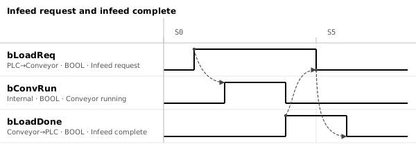
Ranges can also be copied from the editor to Excel, so values edited in the editor go back into the Excel table. Save the chart as JSON with Ctrl+S (the format is in the JSON data format).
5. Even if the specification is in Excel, draw the chart from the value table and replace it
Even when the rules say the specification is delivered in Excel, draw the chart from the value table and paste the exported PNG. Never edit the pasted picture; to change it, change the value table and paste again. Editing the picture directly lets the table and the chart drift apart.
The tool used for the figure in this article
- Timing Chart Editor — The figure above was made by pasting the value table, drawing the arrows and exporting as SVG. It runs in the browser, and nothing you enter is sent anywhere.
Related articles
- How to draw a timing chart
- Making a timing chart in draw.io
- Handshake timing chart (sample)
- Let AI draw the specification
yk.builds